Getting Started
CloudaIDE is a Web Application Development Framework. The main part of it is CloudaIDE Designer – the tool to create CloudaIDE applications. The CloudaIDE Designer includes a Form Editor. This editor lets the programmer to define the screen layout, the code to execute in response to events. The CloudaIDE programming language is a small subset of the PL/SQL. It is simple and easy to learn. The compiler of CloudaIDE Designer compiles the screen layout and code into JavaScript. The JavaScript code is executed within the browser.
CloudaIDE Designer is an Eclipse product. While designing the application set the Build Automatically option in project menu option. All the validity checks and compilations are performed upon saving project files.
It is quite difficult to write the code that makes AJAX calls. The programmer needs to program using so called callbacks. Even in the quite simple case of single AJAX call the programmer has to lot to do. Imagine a program that needs callbacks in loops. This was an uneasy task. Not anymore with CloudaIDE. The CloudaIDE engine relieves the programmer from thinking about callbacks.
The framework takes care about the programmer. It compiles and copies the compiled application to the local Jetty web server. It is done without programmer intervention. The programmer after some work on the system just "runs" the application or "reloads" it if, it was previously run. All the compiling, and deployment of the application on the development server is done behind the scenes.
After the application is ready for the deployment, all the programmer has to do is to copy the war directory or "load" the war file on the production Java EE server. All the application is prepared by the CloudaIDE Designer. Thus you do not have to know any of Java or JavaScript to produce at lightning speed powerful Java EE applications.
Creating a Project
A CloudaIDE application is an Eclipse project. It is created using the project creation wizard. From the main menu of Eclipse Workbench choose File ➜ New ➜ Project ➜ CloudaIDE ➜ CloudaIDE Project or select Create Project from Toolbar button Menu.
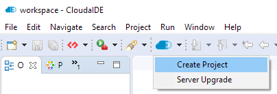
Figure 1.
Project creation wizard - first step
Fill in the project name and choose the database system in use. After pressing Next, the second wizard page will be presented.
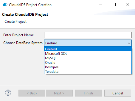
Figure 2.
Project creation wizard - second step
Fill in an appropriate JDBC URL, user name and password for the design purpose. Take into account, that the user name and the password depending on the database system can be case sensitive. The user name is used in the system for the authentication and the schema specification purposes. Be careful, because, in some databases (e.g. Oracle) user can authenticate case insensitive, but the schema name is case sensitive.
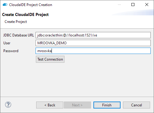
Figure 3.
Project creation wizard - third step
After pressing the Finish button a new application will be created. In the Package Explorer the new Demo_project entry can be seen.
This project contains two things essential to understand CloudaIDE development. One is the mroovka.formica_cfg file in the top folder. This is a text file containing global project configuration information. The syntax and semantics of it is described in the Language Reference. The other item is the mroovka folder. The purpose of it is to hold CloudaIDE form design files. Those files have the formica extension (the Latin word for ant). The AAAMain.formica file is the form which is executed first on application start.
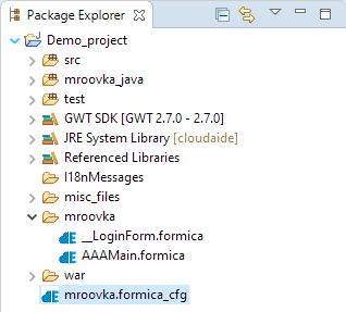
Figure 4.
Package Explorer
Launching Basic Application
After creation of the project the developer receives a "Hello World" application. It can be run in the development mode. To do it the developer has to launch the context (right click) menu at the project node in the Package Explorer and choose Run as ➜ Web Application (Super Dev Mode).
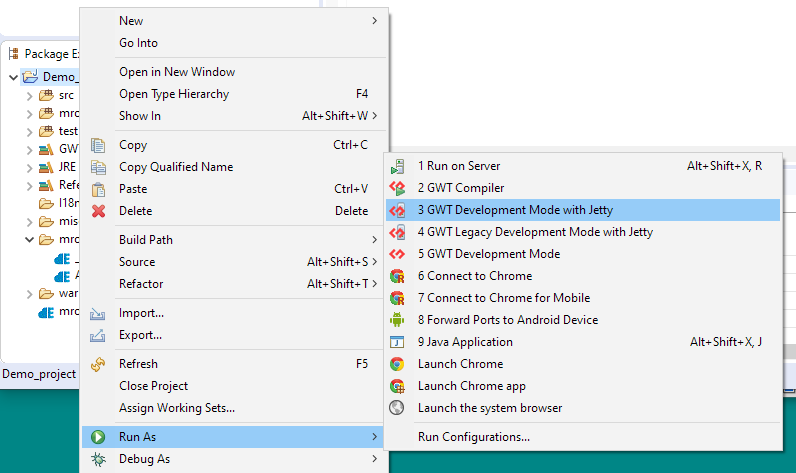
Figure 5.
Running application
After some time, the Eclipse opens the development view with the application run URL. It can be right clicked to display a context menu or double clicked to run the application immediately.

Figure 6.
Running application in a browser
This launches the browser with the initial form displayed.
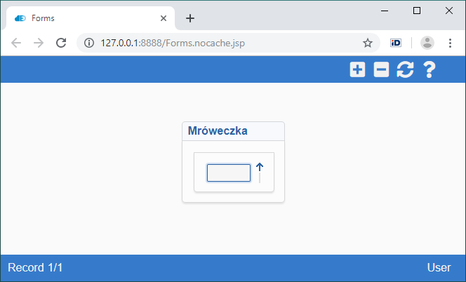
Figure 7.
CloudaIDE form in the browser window
The CloudaIDE browser window has tree main parts:
- Form Panel in the center. This is the area where the forms are displayed.
- Toolbar on the top (initially containing only help icon). The toolbar set of icons is determined automatically by the system. It depends on some system state parameters.
- Menu (initially empty) on the left side. The contents of the menu is determined by the programmer.
What is the Form?
CloudaIDE Application consists of forms. Form is a means of the user interaction with the application and has many analogs in other frameworks. Forms are files with formica extension that reside in the CloudaIDE folder. Forms are required to bear unique names. The names can consist of letters, digits, underscores, dollar signs and cannot start with digit. The names are case sensitive.
The CloudaIDE folder can contain subfolders, but the names of forms have to be unique within the application. The name of the form file has to match the form name property.
Form Editor
After double clicking on the AAAMain (starting) form, the CloudaIDE Form Editor opens up in the central part of the Eclipse window.
Eclipse lets developers use so-called perspectives to organize tools on screen. CloudaIDE has a perspective of it's own. The main elements of the CloudaIDE Design perspective are:
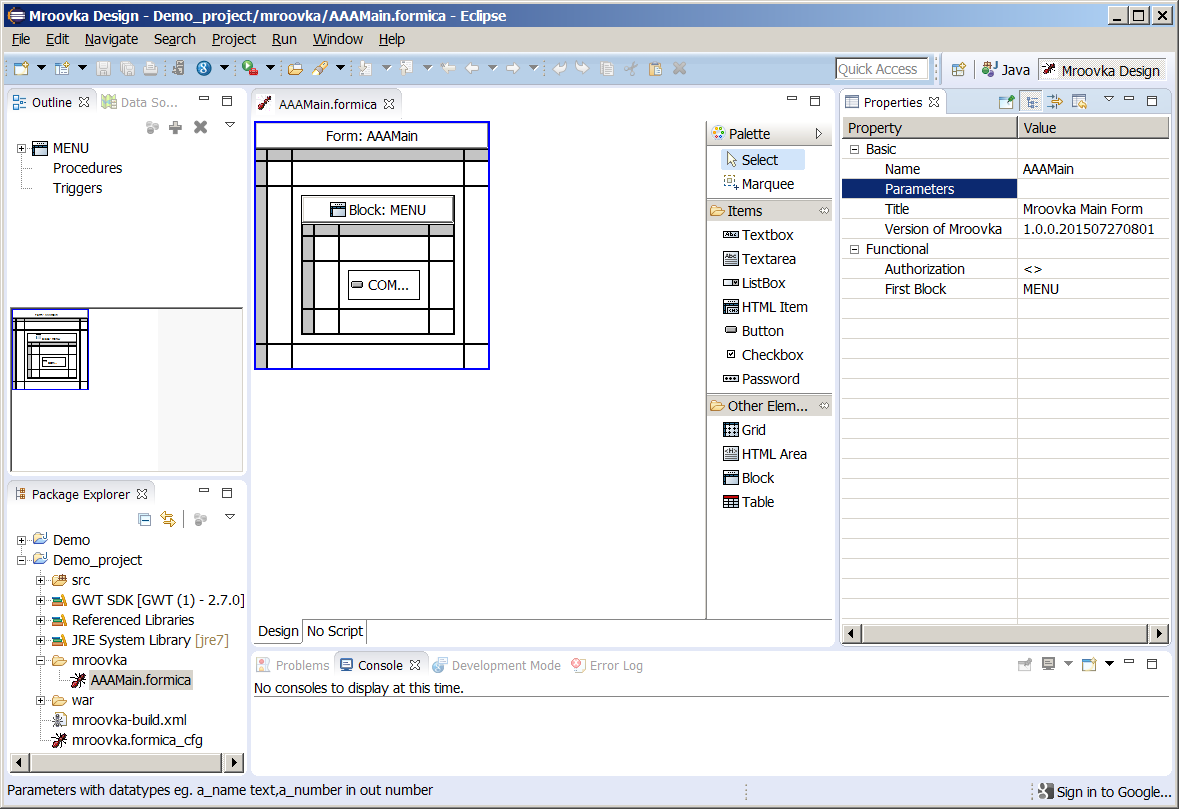
Figure 8.
CloudaIDE perspective
- The Form Editor in the central part of the Eclipse Window. This is the part that displays a schematic view of the form screen layout. There can be open many editors at the same time, but only one can be active. Within the editor the Tool Palette can be seen.
- The Outline View. The outline view consist of two parts – Navigation Tree and the Miniature View. The main purpose of the Navigation Tree is to give the programmer access to those elements of the form that do not have a visual representation. The main purpose of the Miniature View is to show the user what part of the full screen layout is presented in the Form Editor. By means of dragging a selection rectangle the programmer can navigate through a large form in case of necessity.
- The Properties View. The Properties View displays and lets change the properties of a selected element. The selection of an element in the screen editor is indicated by a blue border. In this particular case we see that the forms name is AAAMain (matches with the file name). The form does not have parameters. It indicates the version of the editor with which the form was last saved. And so on. At the bottom of the screen a status line can be seen. This time it explains what can be entered into the parameters form property.
- Datasource Explorer. In this particular case obscured by the Outline View. It is a means of access to the underlying database structures for the purpose of speeding up of form design by automatic design of initial screen layout.
- Palette. The Palette usually displays in the Palette View, that can be accessed by click on the Palette tab in the left top corner of the window, close to the Datasource Explorer. If the view is closed (like in this case) the Palette is displayed on the right side of the Form Editor.
Creating a Form
To create a form the programmer has to use the form creation wizard. It can be done in the following steps:
- Select the CloudaIDE Project (demo_project)
- Select File ➜ New ➜ Other ➜ CloudaIDE ➜ CloudaIDE Form
- Enter a valid form name. For the purpose of this example - Offices
- Click Finish
or
- Select the CloudaIDE Project (demo_project)
- Launch popup menu (right clik)
- Select CloudaIDE ➜ Create Form
- Enter a valid form name. For the purpose of this example - Offices
- Click Finish

Figure 9.
Form creation
Upon completion of this procedure the programmer receives an empty form. The framework shows an error problem marker, that the form does not have any block.
Using the Data Source Explorer
Form after the creation does not contain anything besides 3 rows x 3 columns grid. As such is considered by the system to be faulty. Form can be further built using individual elements from the Tool Palette. The real booster in a form development is the Datasource Explorer. By dragging and dropping tables and views from the datasource the developer can design basic form with lot of functionality.
To use the Datasource Explorer:
- Click on the Datasource Explorer tab in the upper left corner of the window. The explorer will show up
- Choose or create a database connection (for the detailed description of the connection creation look into CloudaIDE platform – specific installation guide)
- Open the connection
-
Select a table or view on which you want to base the data entry in the form
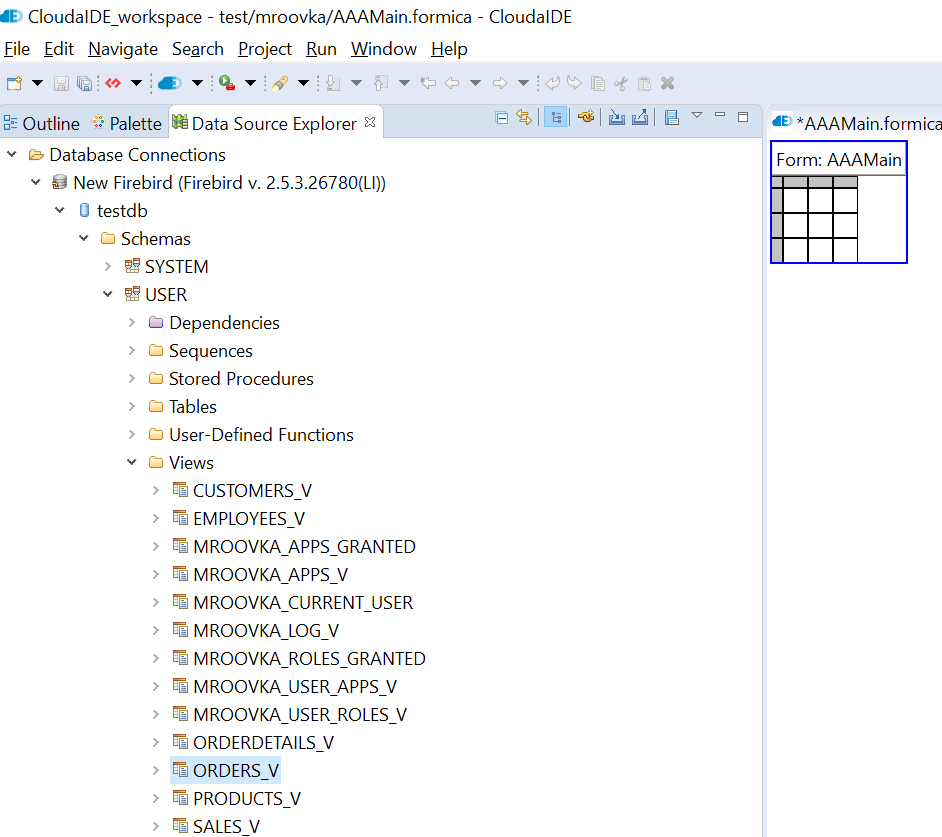
Figure 10.
Datasource Explorer
- Drag and drop the table on the target cell of the form. You will be presented with the Block Creation Wizard.
-
The first step is to select table columns. Unselect the columns that you do not want in on screen. You can set also the order of the columns.
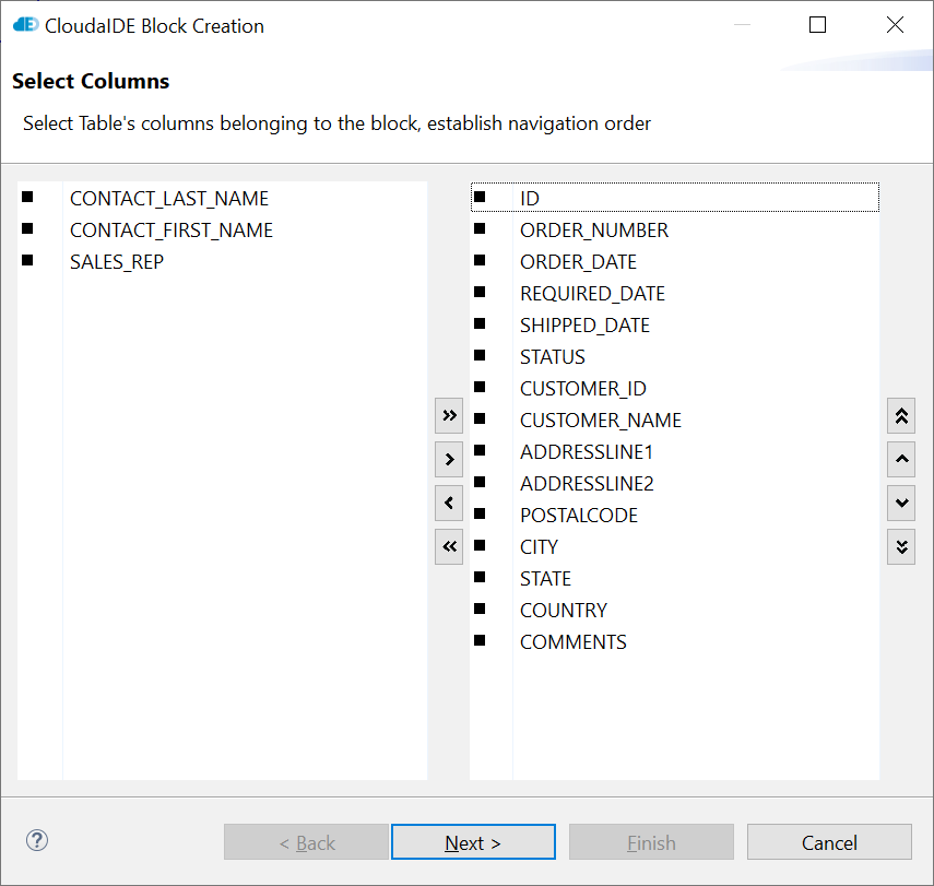
Figure 11.
Block Creation Wizard - Step 1
-
Next, select the columns of your primary key. Please enumerate them in the same order, that are in the index definition in the database.
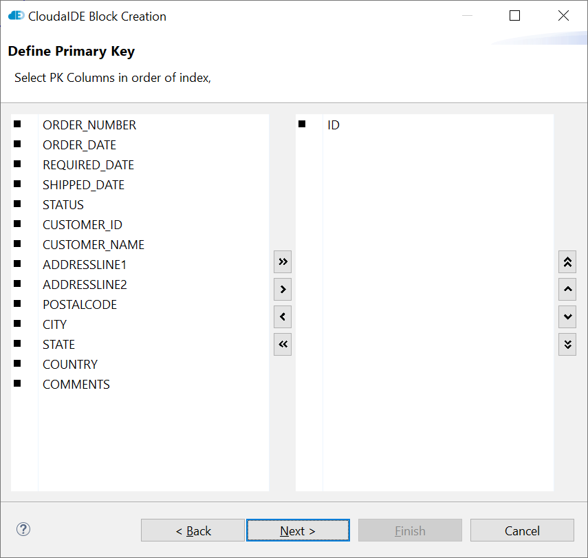
Figure 12.
Block Creation Wizard - Step 2
-
The next page lets set some o the properties of the items that are about to be created.
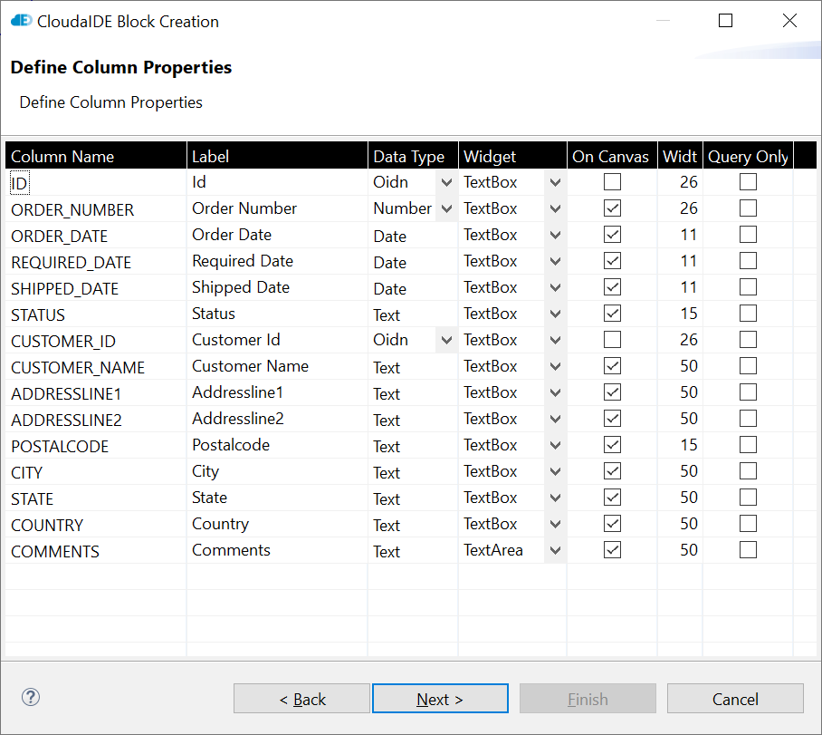
Figure 13.
Block Creation Wizard - Step 3
-
The last page lets to define the screen layout of the items.
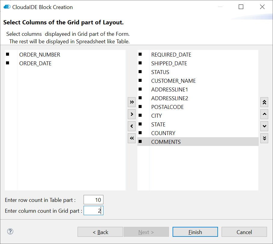
Figure 14.
Block Creation Wizard - Step 4
Unselect all items that should be displayed in the spredsheet-like table. Ultimately all items can be deselected. As a result of this, all items will be displayed in such table. Set columns count in the Grid Part of the layout. The wizard will lay out evenly column-wise all the selected items (right list). In this case the items will be organized in two columns.
-
After clicking "Finish" we receive resulting block.

Figure 15.
We have the following screen in the browser.
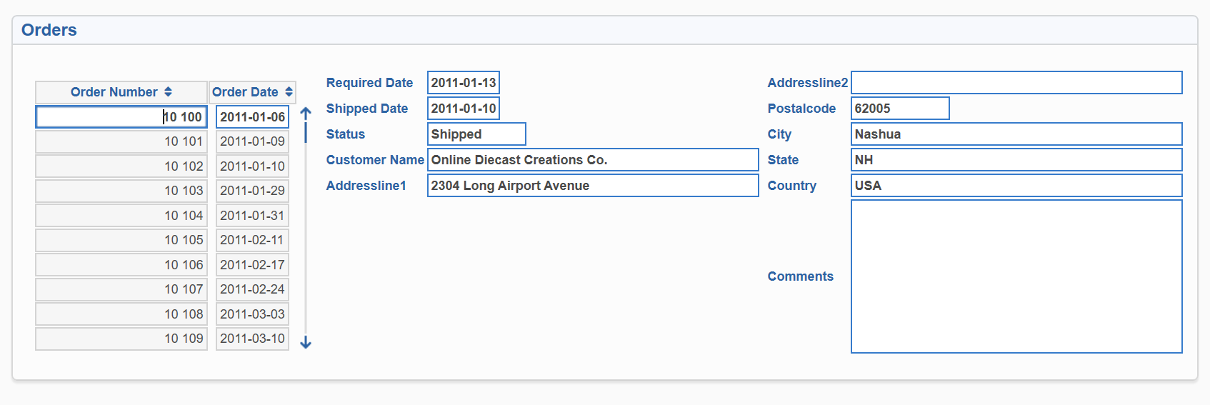
Figure 16.
-
We can correct (touch up) the wizard created block using screen editor.
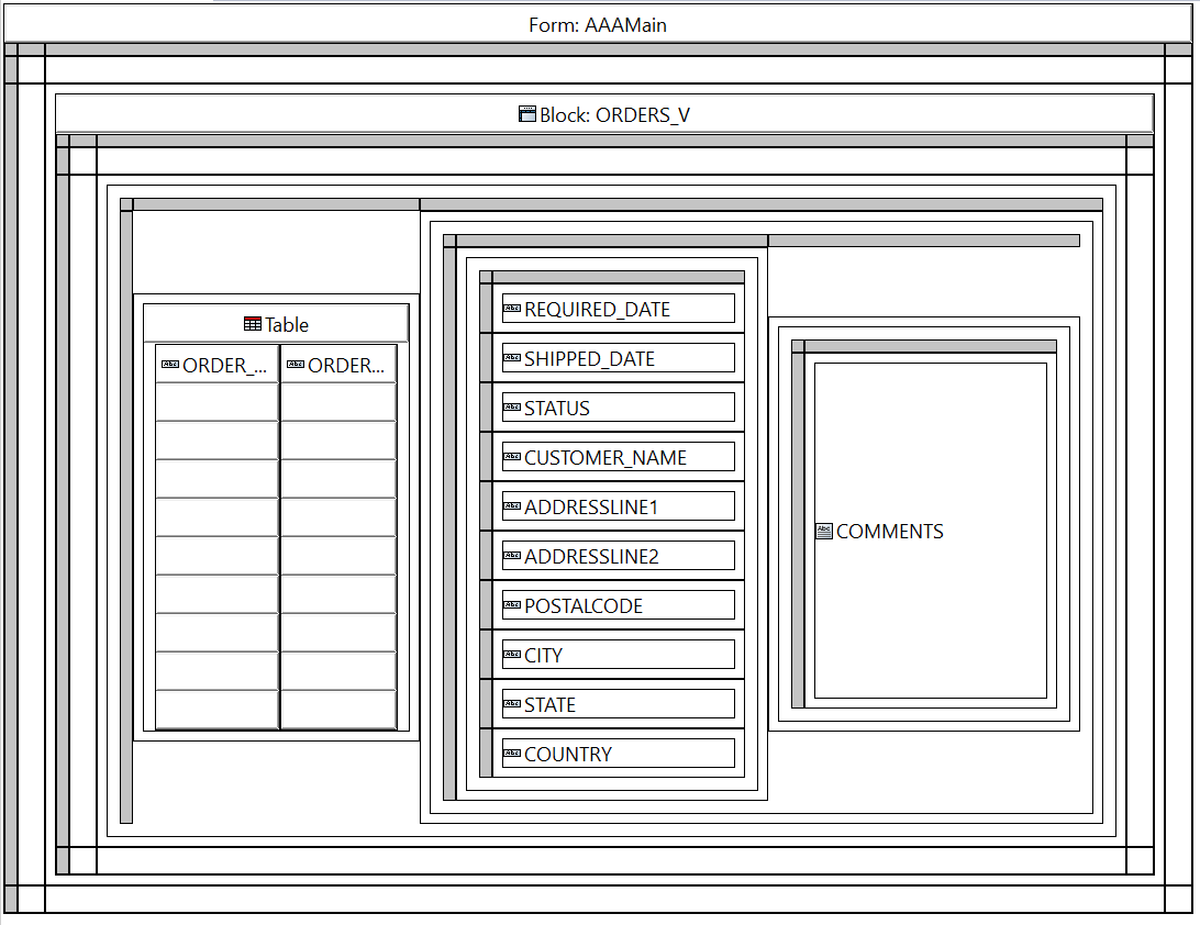
Figure 17.
And we receive the following picture in the browser.
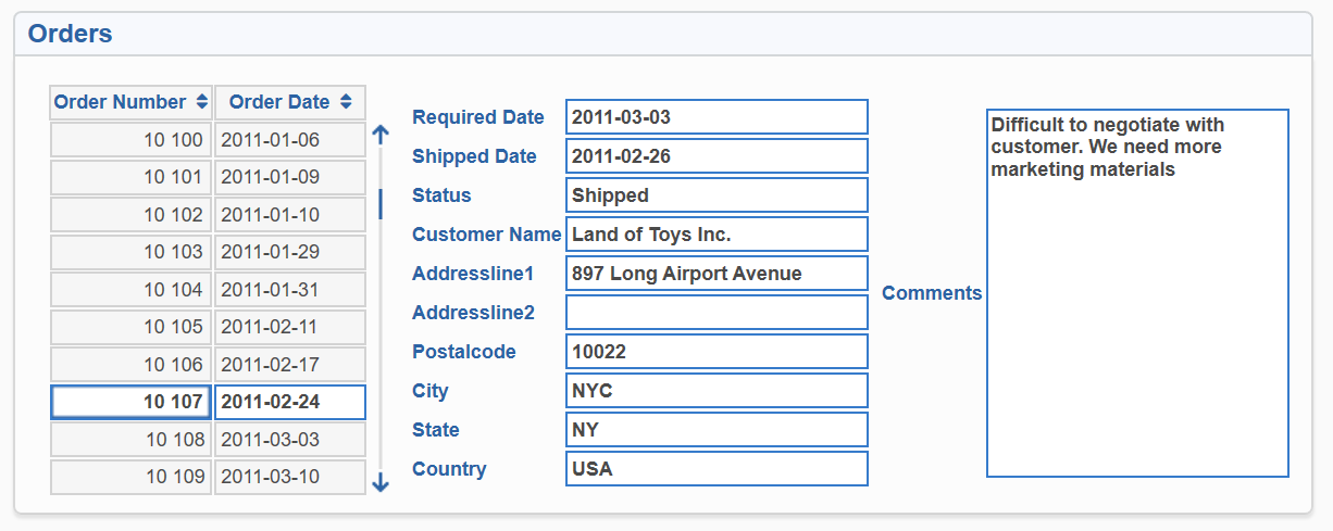
Figure 18.
-
At the top of the form the Form:Offices caption can be seen. The other elements of the form are some nested grids with gray vertical and horizontal bars of row and column handles. Inside the most outer grid, there is another grid with a Block:OFFICES caption on top. This is a screen representation of a multipurpose concept called block. Inside block in the center there is another grid with rectangles representing data elements called items. This design can be built using the Tool Palette. This would be slightly longer lasting operation, that as other manual work is prone to errors.
Programmatically Opening a Form
To show the result of our effort in the browser you can make the AAAMain form open offices form as reaction for a button press event.
- Open the AAAMain form
- Activate the Outline view
- Select the MENU block tree node
- Extend the Items tree
- Select COMMAND button, change it's name and label to OFFICES and Offices respectively
- Extend the Triggers tree
- Click Add new element icon
- Select BUTTON_PRESSED trigger type (Triggers are pieces of code that execute MT language programs in reaction for events)
- The Editors script editor activates itself, allowing the user to type the trigger text
- Change the null; line to open_form(Offices);
The screen should look like this in the Figure 10.
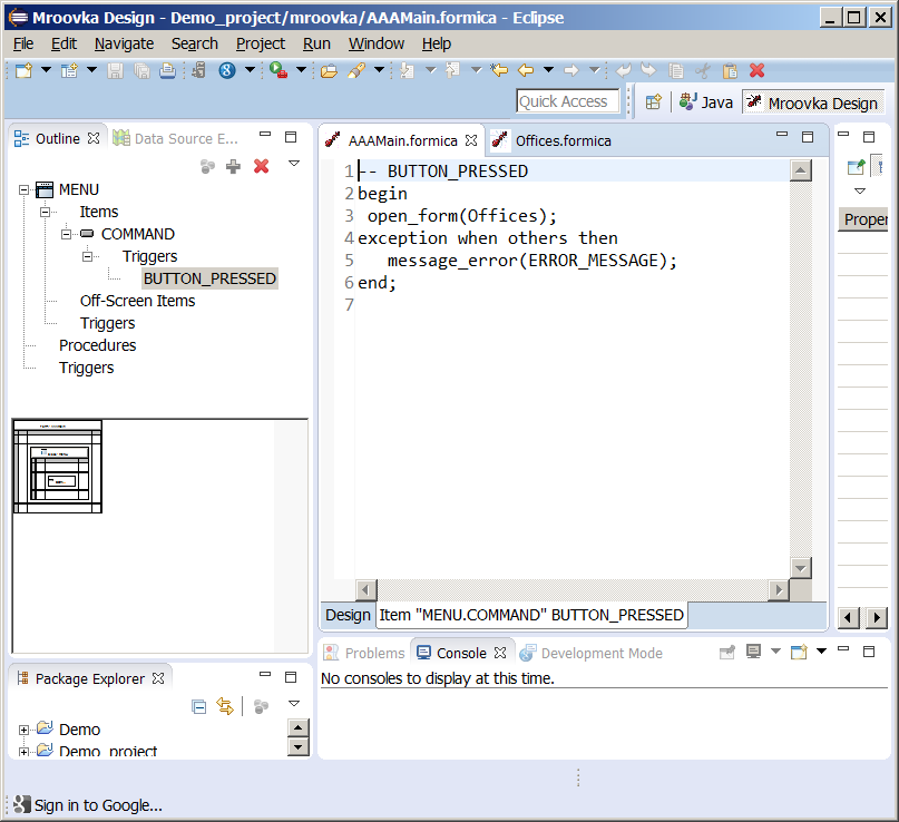
Figure 20.
Trigger definition using CloudaIDE perspective
Press the Save icon, run the project. When the application loads into browser click command button. The newly created form appears. Click the spyglass icon from the toolbar twice. The data is fetched from the database and shown on the screen. The toolbar has some additional icons. The screen looks as on the following figure:

Figure 21.
CloudaIDE form in the browser window displaying data fetched from database
Using the Table Layout Element
We obtained a screen with some items within a block nested grid. To present some screen elements in a table use a table element. You can create a table using the Tool Palette.
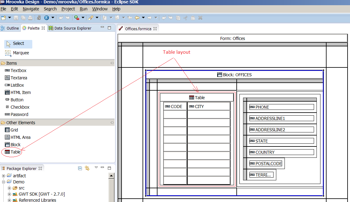
Figure 22.
Table Layout Element
Click on the table tool, then click on an empty grid cell within a block. An empty table appears. Drag and drop the CODE and CITY items to the table. Five row table appears. Change the "Rows displayed" property of the block to 10. The table grows. Every block can contain at most one own table layout element and unlimited quantity of nested grids, which in turn can contain any element barring table. If the nested element is a block, the block can contain own table.
Change the default order of the OFFICES block to "CODE".
You received a layout where the CODE and CITY items of the Offices block are displayed in a 10 rows table and the other items of the current (highlighted) record are displayed in a grid. You have full CRUD functionality with the Query by Example mechanism out of the box.
What is the Block?
The block has two functions:
-
Data binding
From this perspective the block is an unlimited array of records. Records consist of items. The block can be database bound (linked with a database view or table) or control block (having client only items). An item of a block is addressed by bind variable syntax :BLOCK.ITEM where BLOCK is the block name and ITEM is the item name.
-
Layout
From this perspective the block is a grid of cells able to hold other elements. If the element is an item, the item becomes a member of block record. If there is another block within a block layout element, the items within the nested block go to that block of course, not to the outer one.
Master-Detail Block Relationship
For every database item you can set a master item. This way you can define a master-detail relationship of an arbitrary complexity - multi-master, multi-detail, multi-level. The only limitations are the sound reason and resources. Also the relationship between the master and detail block can consist of many items (multipart key).
To establish a master-detail relationship set the "Master Item" property of the detail item. The Fig (based on Orders form of demo application) shows that the master item property of DETAILS.ORDER_ID item is set to ID item of the ORDERS block.
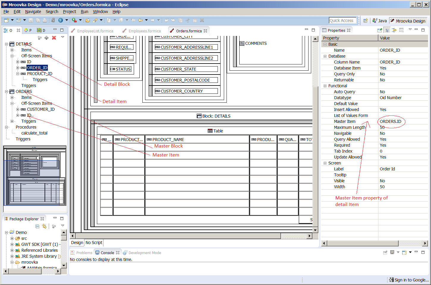
Figure 23.
Definition of the master-detail block relationship
Table Summaries
To automatically show a sum of a table column of a database block you have to set "Fetch All" property of block to "Yes" and set the item property "Has Summary" to "Yes".